Your cart is currently empty!
How to achieve the perfect fusion of modern and vintage style in your home
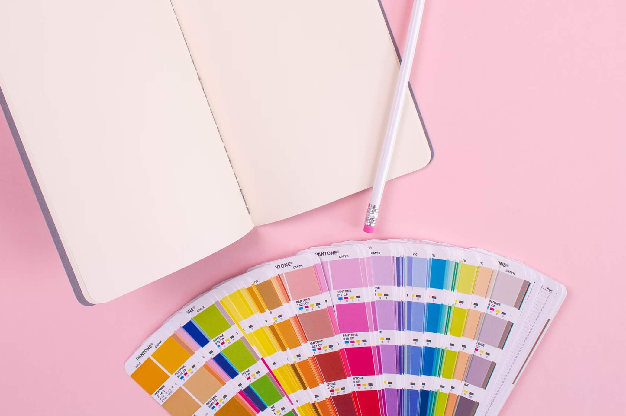
Tips on Selecting Your Interior Design Color Palette
For the best designs to come to life, they must have the best colors. Thus, colors have the power to alter the visual appeal of your habitat. Therefore, it is important to give enough time and thought before selecting the color of interiors for your house. There is a lot of color theory and things like color wheels that will help you methodically figure out the perfect ones. But it doesn’t have to be that hard. Here are a few guidelines that can help you get started.
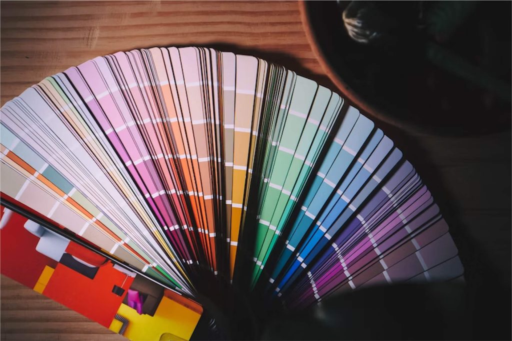
Be guided by color palettes
- Monochromatic is where the color scheme uses on the tone of the same color with either a black-ish or a white-ish hue to accentuate that color. Green could be used in this sense as either vibrant green or pastel green.
- Analogous color schemes use colors that are similar to one another on the color wheel. For example; red is typically considered analogous to pink and yellow is to either green or orange.
- Contrast is where your vibrant and upbeat side comes out. This is a more dramatic way of color matching. This scheme involves a triad of color combinations that might go well together, but aren’t necessarily belonging to the same color families.

You Have Inspiration All Around You
From magazine clippings to websites, there is an abundance of images of interior living spaces. You do not have to start with no input whatsoever, nor is this the same as having your favorite color since childhood takes over your adult home as well.
